Rebranding for a Hasselt-based collective in architecture and interior design.
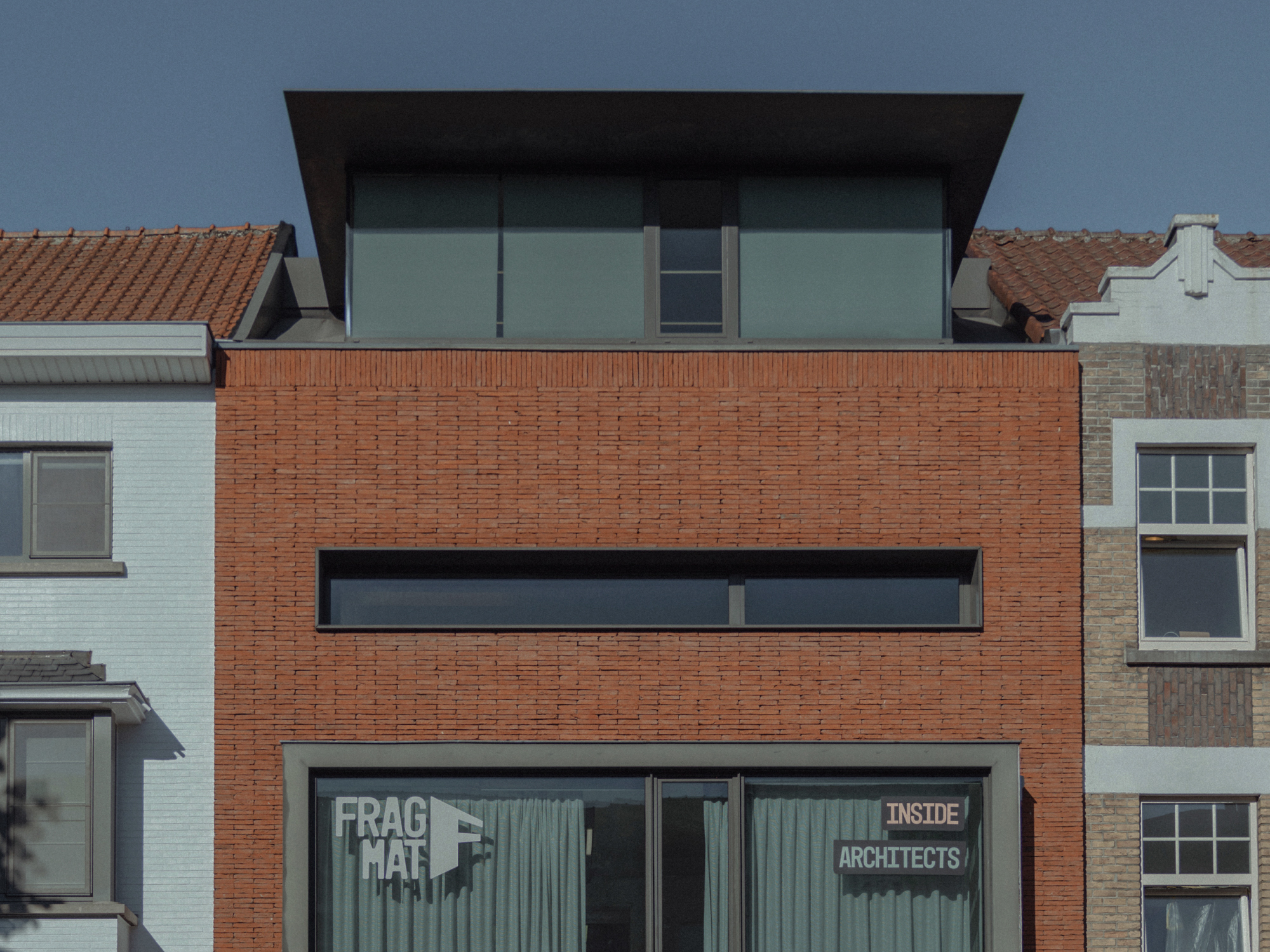
Fragmat brings architecture and interior design together. Fragmat Architects manages the entire building process. Fragmat Inside designs and produces interiors in its own workshop. Together they focus on smart design: turning practical needs into distinctive, considered spaces.
Fragmat started as a single brand. Two studios worked under one name while serving different audiences. Architects works with developers and property investors, Inside with businesses and private clients looking for a custom interior. The challenge was to create two separate sub-brands, each with its own identity, yet clearly part of Fragmat.
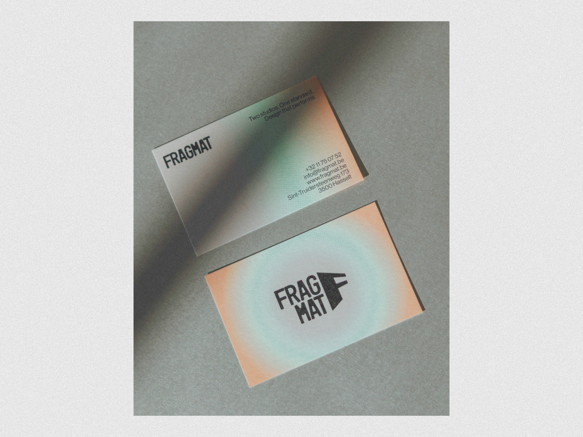
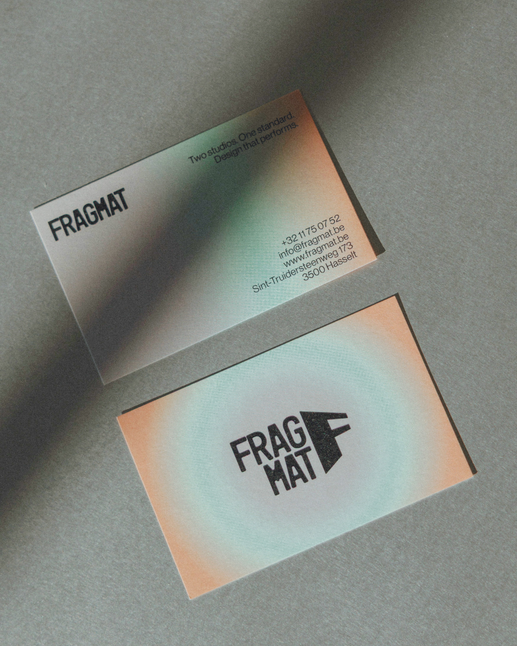
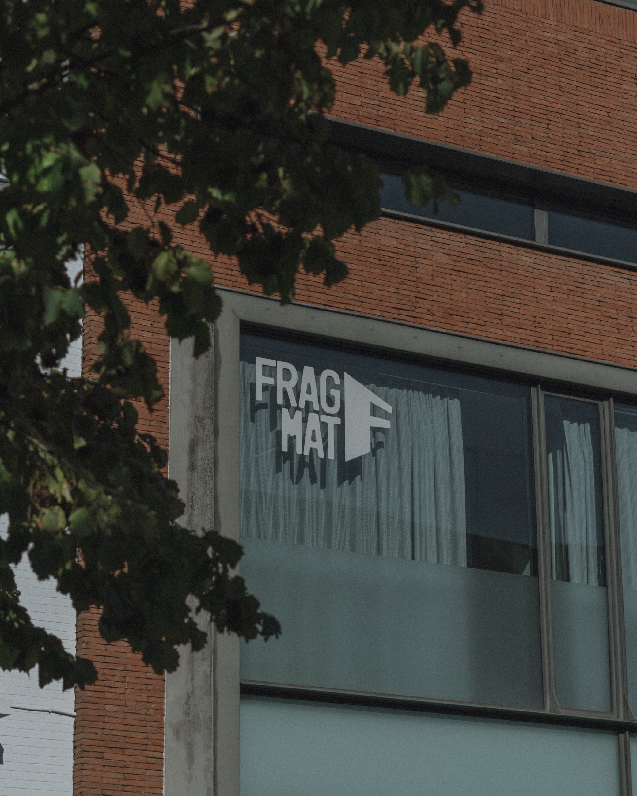
The slanted F monogram anchors the system. Architects and Inside share the same visual language, each with its own initial and accent colour: green for Architects, terracotta for Inside. The parent brand brings both colours together in a single gradient, with grey as the connecting tone. The parent brand appears only where Fragmat presents itself as a whole. In day-to-day communication, each studio speaks for itself.
Each studio now has its own Instagram account. The website is split in two as well. A portal on fragmat.be lets visitors choose between Architects and Inside. Each part has its own homepage, projects and contact page, with its own tone of voice.
Site banners, business cards, folders, flyers, stickers, email signatures, social templates and a presentation film for the Dentex trade fair.
Branding, website, motion design and print.