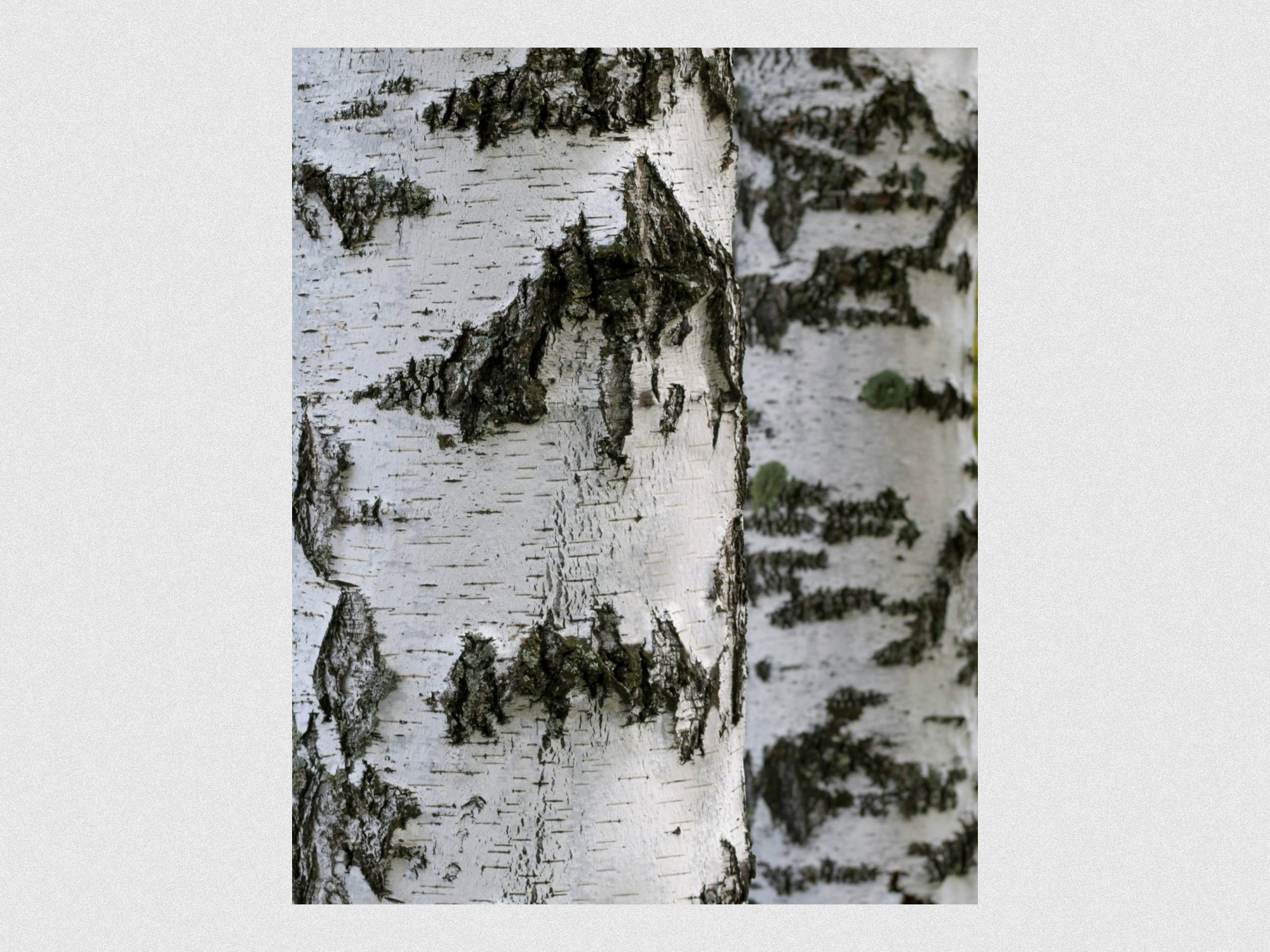
Berkana is the studio of Katrin Vyncke, where Dru Yoga and art come together. The name refers to the birch tree and symbolizes growth, renewal, and gentle strength. This meaning shaped a brand centered around balance, resilience, and inner calm, inviting people to slow down and reconnect with themselves.
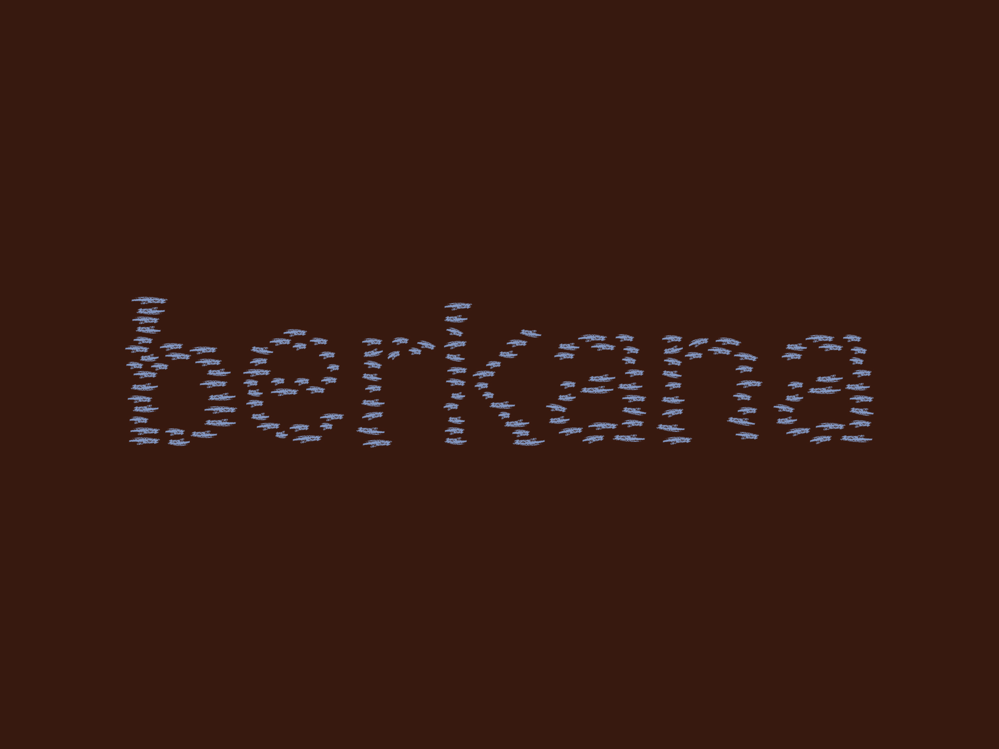
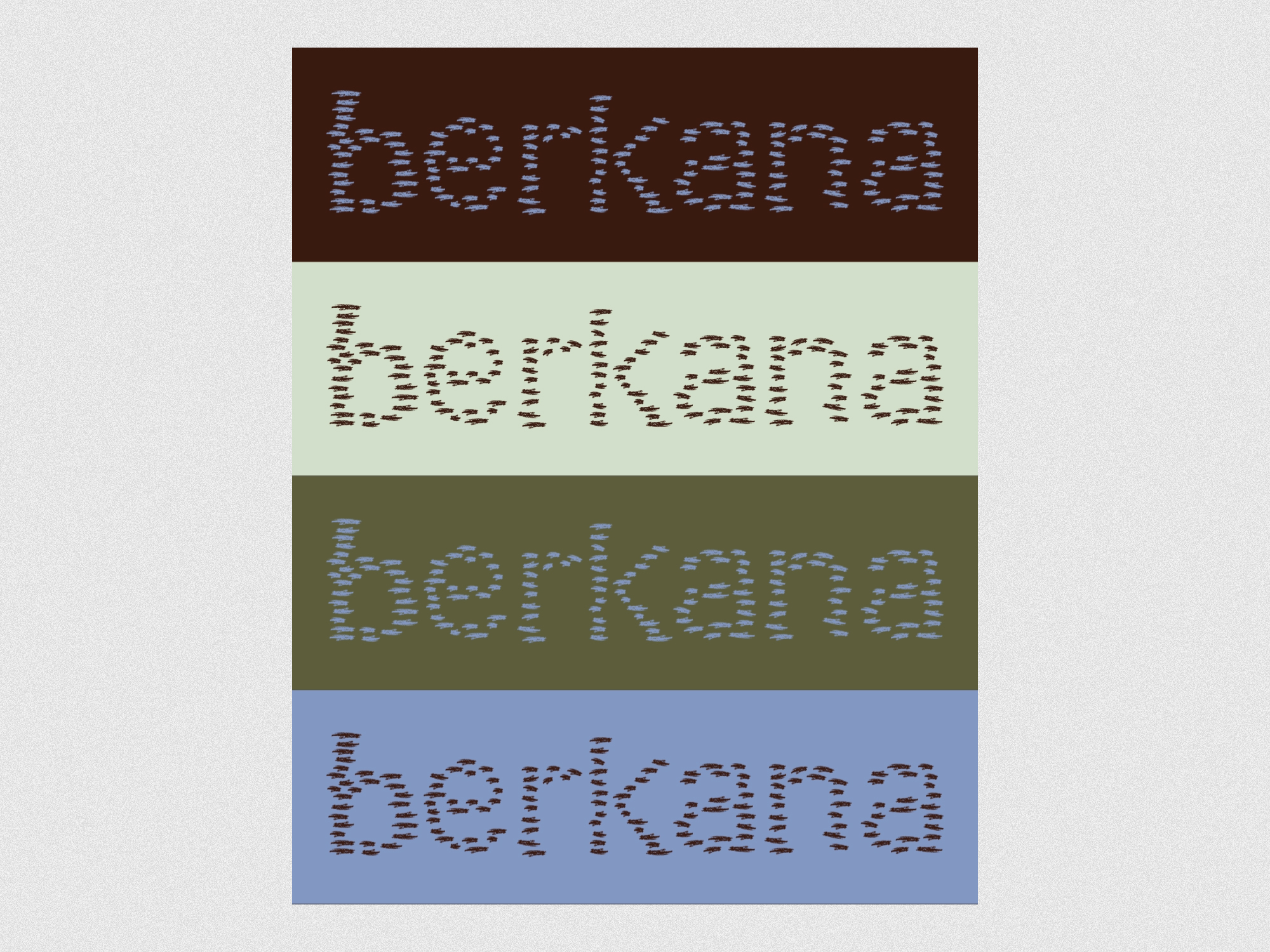
The visual identity is rooted in the structure of the birch tree. The wordmark is built from organic, linear forms that reference the tree’s characteristic bark, creating a calm and grounded presence. Combined with a soft, natural color palette and refined typography, it results in a visual language that expresses softness, connection, and clarity.
The website brings everything together in a clear and intuitive digital experience. Photography plays a central role, capturing the atmosphere of the studio through images that convey calm, presence, and authenticity. The result is an online space that not only informs, but feels like a first introduction to the world of Berkana.