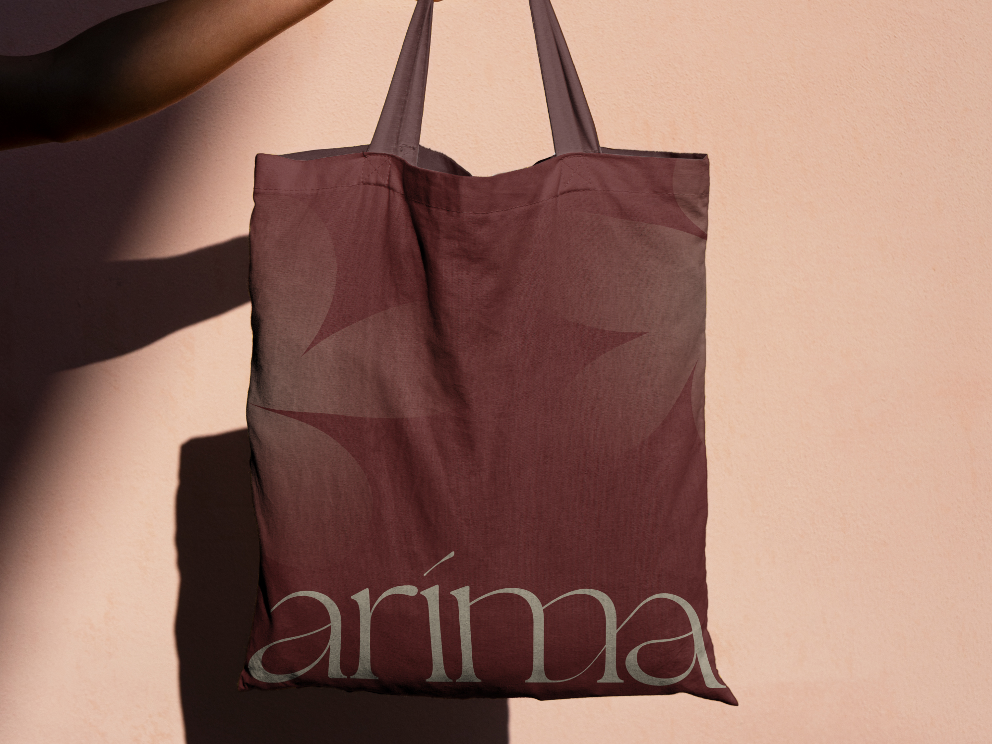
Branding for Arima, a talented floral designer specializing in events and weddings.
Arima means “soul” in Basque, a name that forms the emotional foundation of the brand. The chosen color, a deep reddish brown inspired by Basque split stone, reflects this essence and symbolizes warmth, authenticity and trust.
The logo conveys refinement and luxury through elegant flowing lines that introduce a sense of romance and finesse. At the same time, subtle playfulness adds warmth, personality and a welcoming character, balancing sophistication with approachability.
In addition to the brand identity, I am currently developing the website, translating the visual language into a digital experience that feels just as soulful and refined as the brand itself.